2026 NWSL Kits Ranked: From Weakest to Strongest Design
With a new season comes a fresh wave of kit design, and the 2026 NWSL collection marks one of the most ambitious efforts yet from Nike and the league. Each

With a new season comes a fresh wave of kit design, and the 2026 NWSL collection marks one of the most ambitious efforts yet from Nike and the league. Each of the 16 jerseys tells a story rooted in its club’s city and community, blending colour, motif, and local pride. NWSL VP of Consumer Products Katie Eaton described the collection as a celebration of “local pride” that captures the “energy, culture and passion” driving the league’s rise. Here, every kit is ranked from the least successful execution to the strongest.
The 2026 NWSL Kit Rankings
16. Boston Legacy
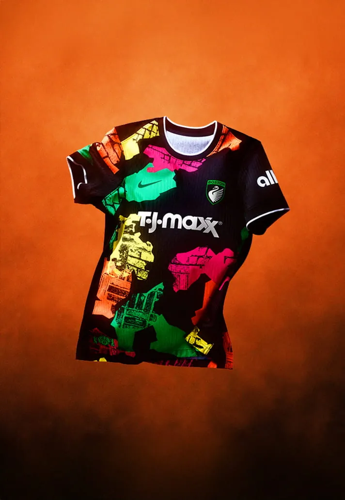
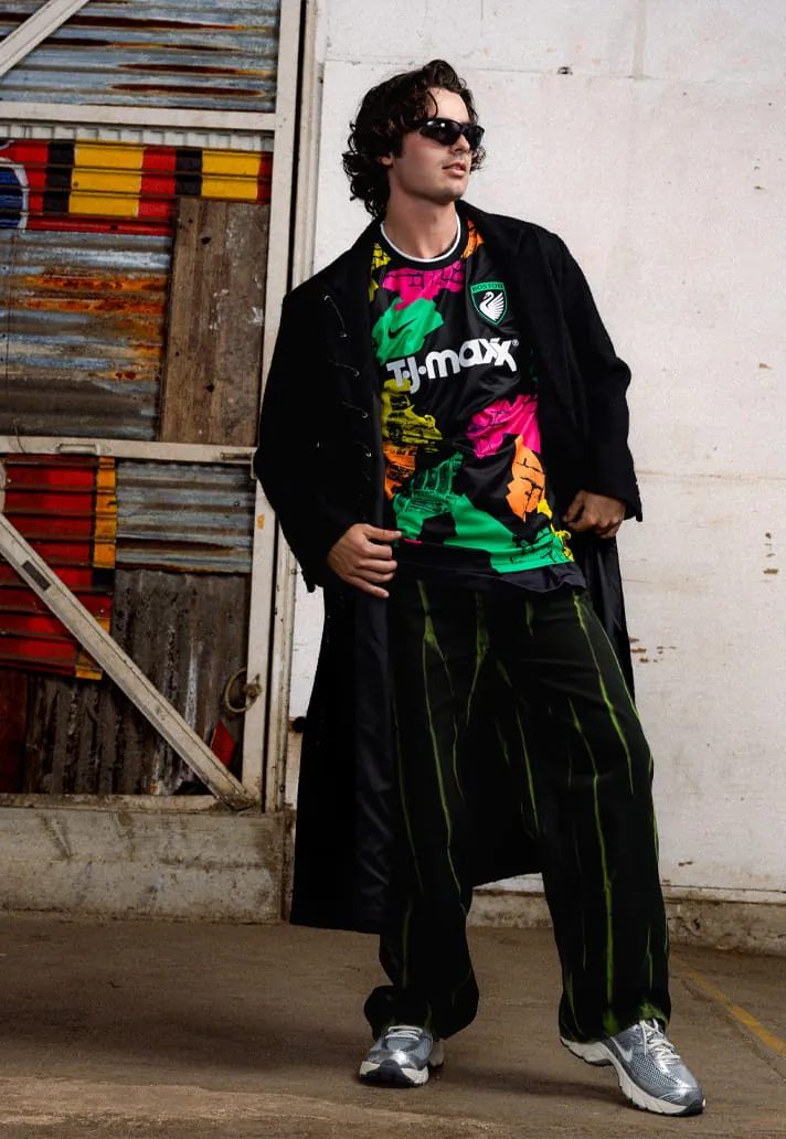
The debut club’s ‘Common Ground’ kit uses shapes meant to evoke Boston neighbourhoods and a brick pattern representing the city’s roads. The design walks a fine line between bold and brash, landing on the wrong side for this ranking.
15. Seattle Reign FC
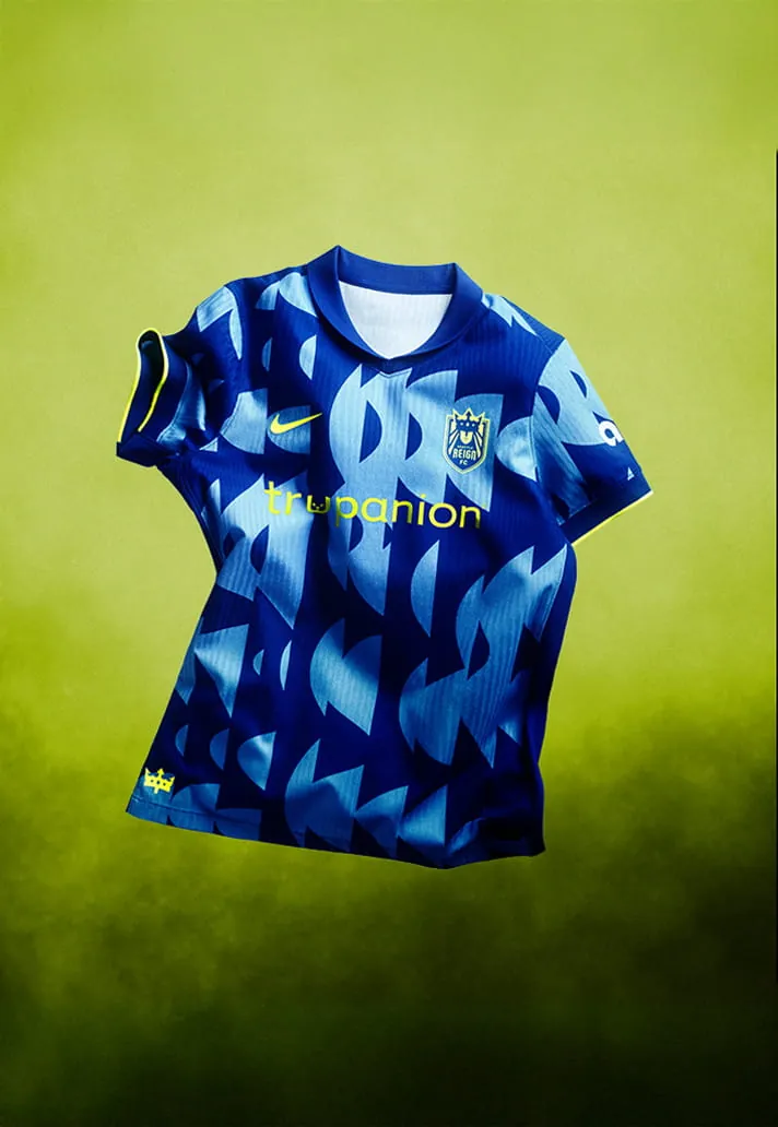
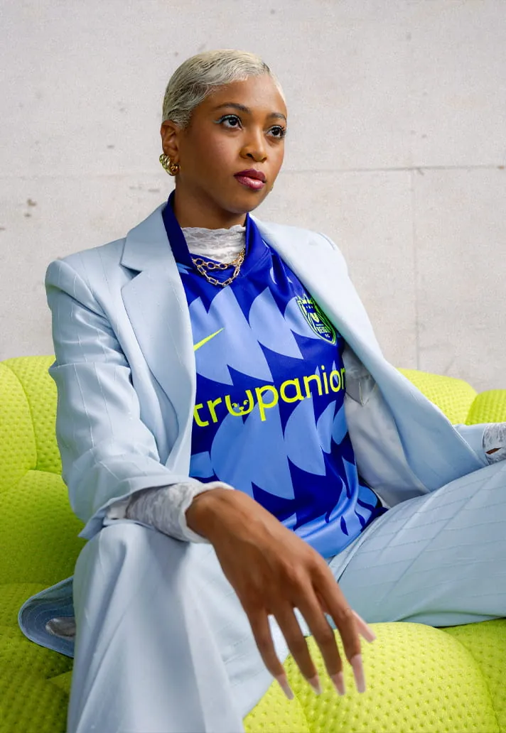
The ‘Surge Kit’ aims to symbolise legacy in motion, a tribute to the foundation built over time and the next generation stepping forward. The execution feels disjointed, lacking the coherence of stronger entries.
14. Gotham FC
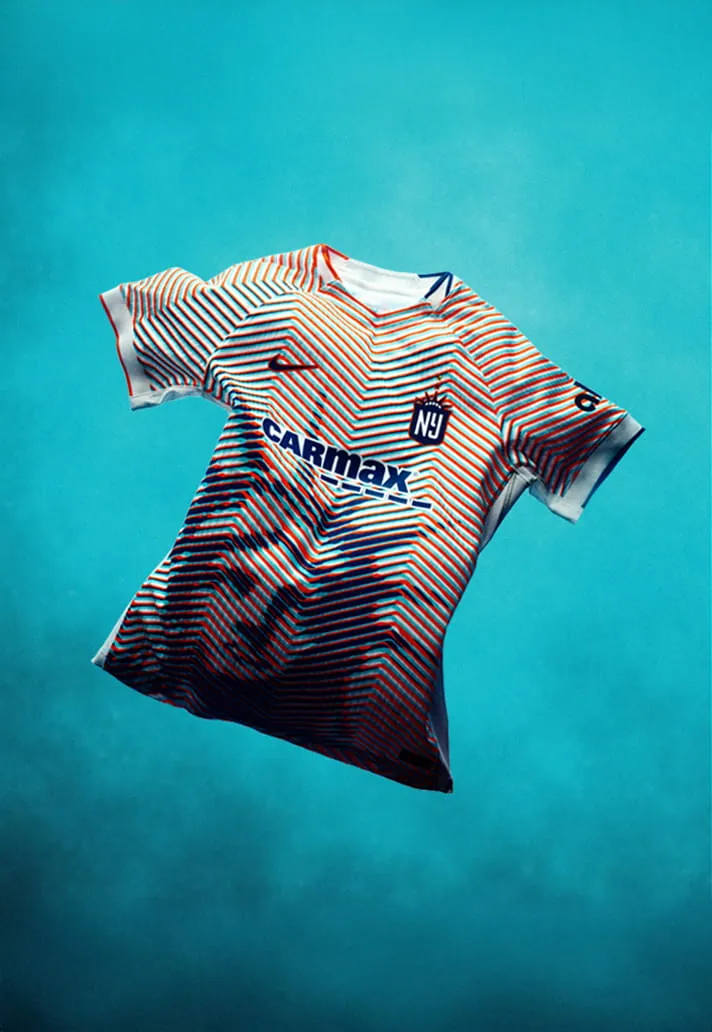
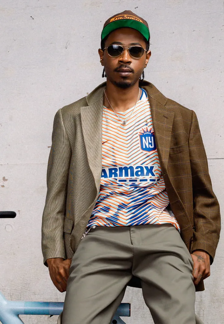
Inspiration for the ‘Lady Liberty’ kit is obvious, but that directness works against it. The design is a little too on the nose for a memorable look.
13. Washington Spirit
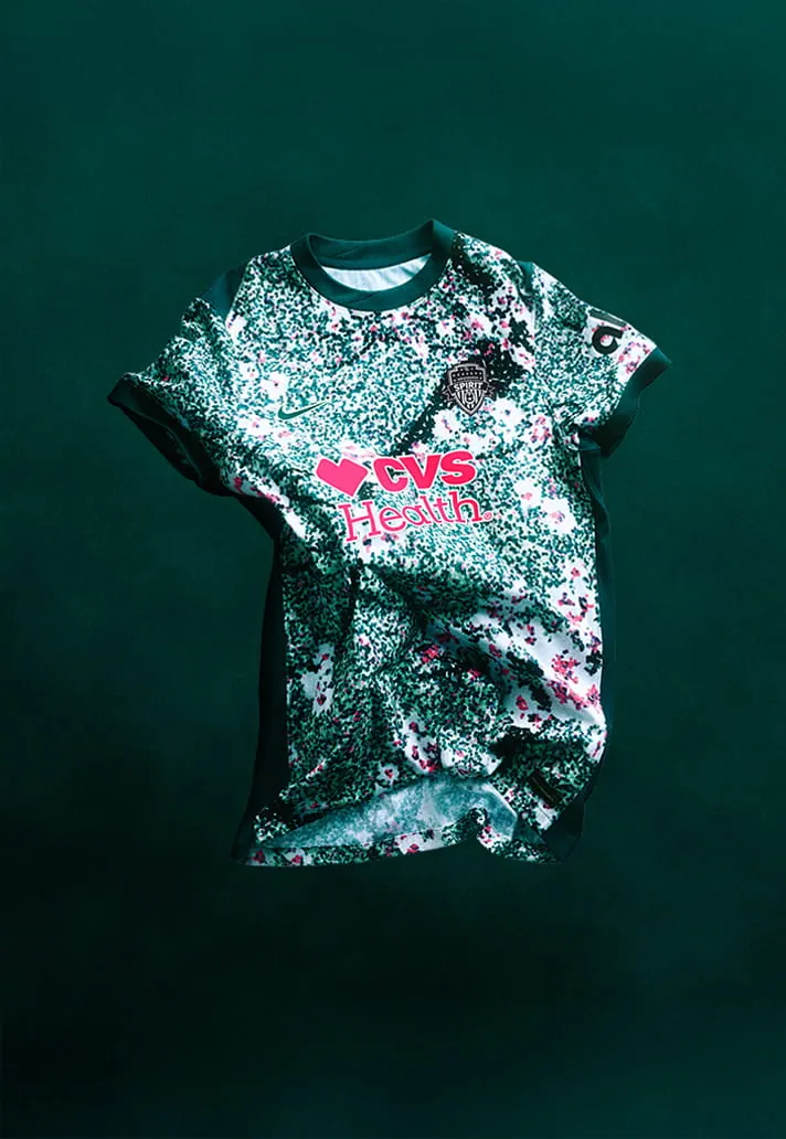
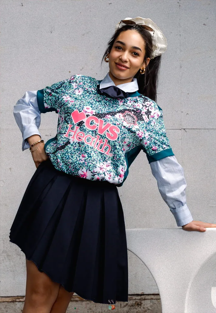
‘The Spirit in Bloom Kit’ attempts to capture DC’s iconic cherry blossoms and a dark green Potomac River motif. The result is overly busy, reminiscent of a 3D eye puzzle that never quite resolves.
12. Denver Summit FC
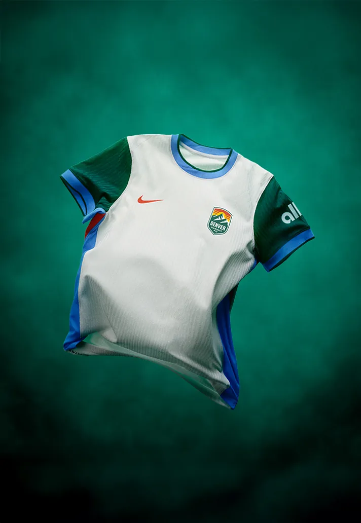
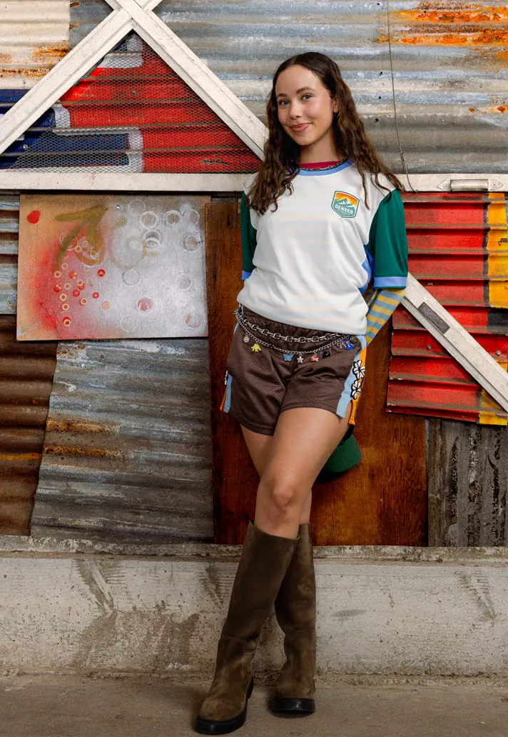
The second debut side’s ‘Summit Snow Kit’ draws from fresh snowfall, stillness, and cold‑weather resilience. In practice it’s mostly white, saved from mediocrity only by the block colouring on the sleeves and side panels.
11. Orlando Pride
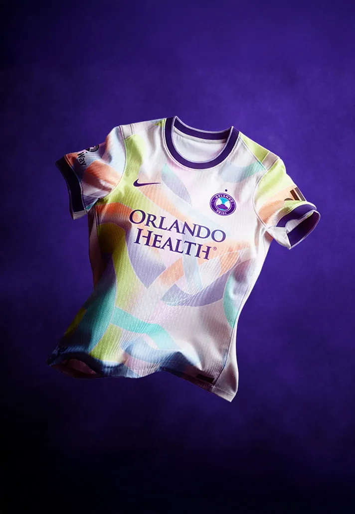
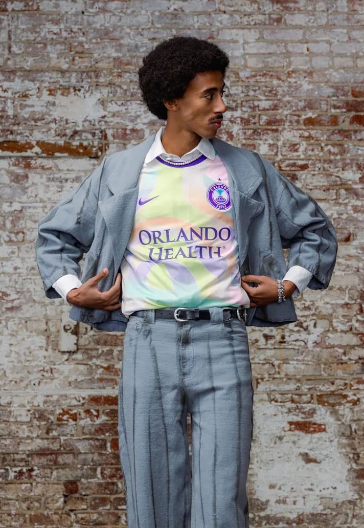
The 2026 Unity Kit commemorates the 10‑year remembrance of the Pulse Nightclub tragedy, symbolising strength, resilience, and unity. The meaning is powerful, but the design feels a little washed out.
10. Bay FC
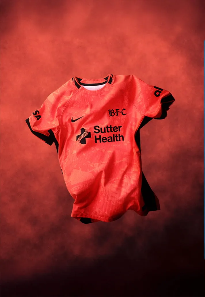
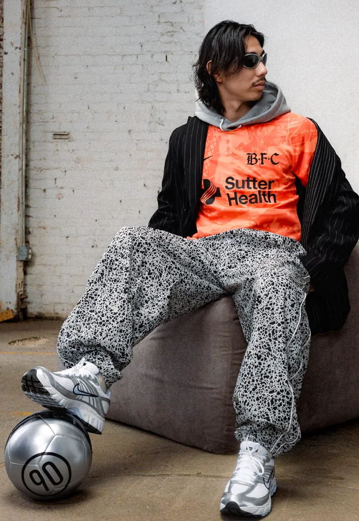
The Poppy Kit brings a bold primary colour for the first time in club history. Yet one strong colour alone is not enough to stand out in today’s kit landscape.
9. Racing Louisville FC
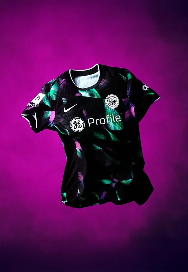
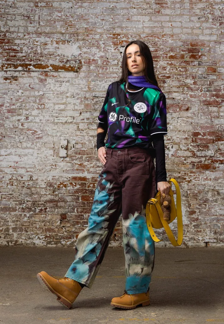
The Disco Kit pays homage to Louisville’s unique disco‑ball heritage—the city once produced 90 percent of the world’s supply during the disco era. As a kit, it’s not bad, but not great either.
8. Utah Royals FC
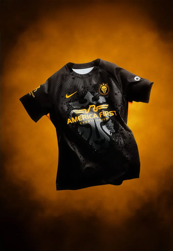
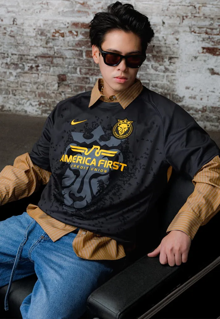
The Swarm Kit honours Utah’s identity as the Beehive State. The sleek black‑and‑yellow combination and sublimated details work well, though the lion motif overshadows the bee element.
7. North Carolina Courage
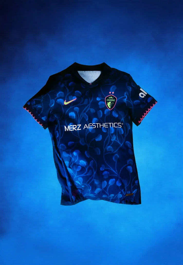
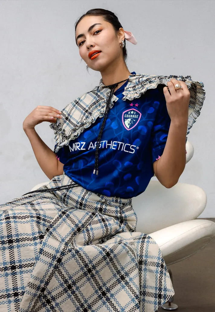
The ‘Believe kit’ is the club’s first ever third kit, featuring a Venus flytrap pattern—the state’s official carnivorous plant—woven into deep tonal blues. The pattern suits evolution and timing, though some may wonder if green would have been a better fit.
6. Portland Thorns
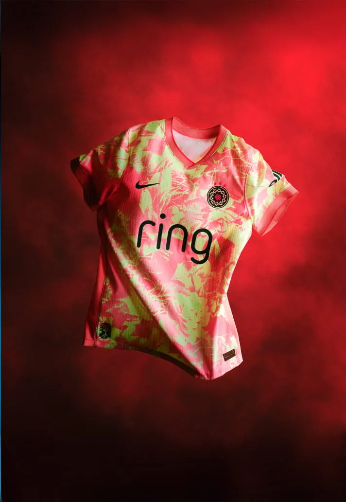
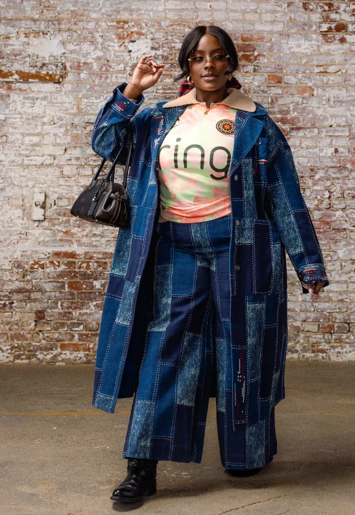
‘Electric Bloom’ strikes a balance of grit and grace with atomic pink and voltage yellow roses. The strong, unique pattern befits the club’s identity.
5. San Diego Wave FC
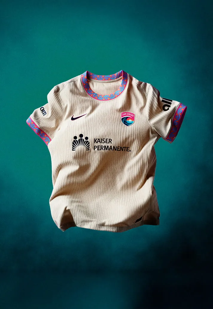
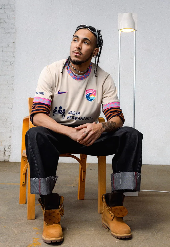
At first glance the ‘Balboa Park kit’ may seem bland, but a second look reveals elegant detailing on the collar and cuffs, inspired by San Diego’s 1,200‑acre urban oasis. The beige base lets the trim take centre stage.
4. Chicago Stars FC
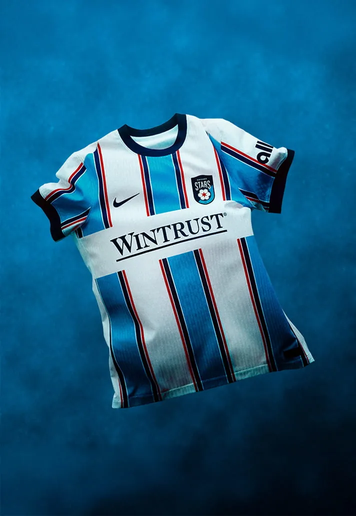
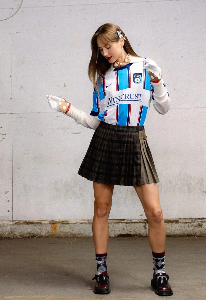
A strong look drawing from the city’s most recognisable landmarks and fortitude. It carries a hint of traditional jersey design with a progressive edge, executed boldly.
3. Angel City
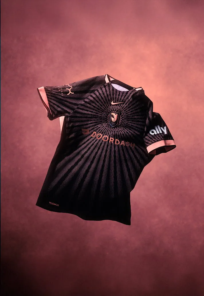
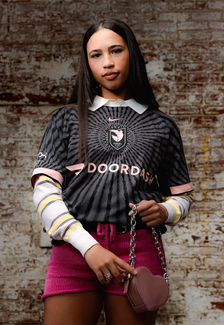
‘The Flare Kit’ features a central crest with a sol rosa sunburst pattern radiating outward. The design is eye‑catching and smartly executed in the club’s traditional colours—a fitting way to mark five years.
2. Kansas City Current
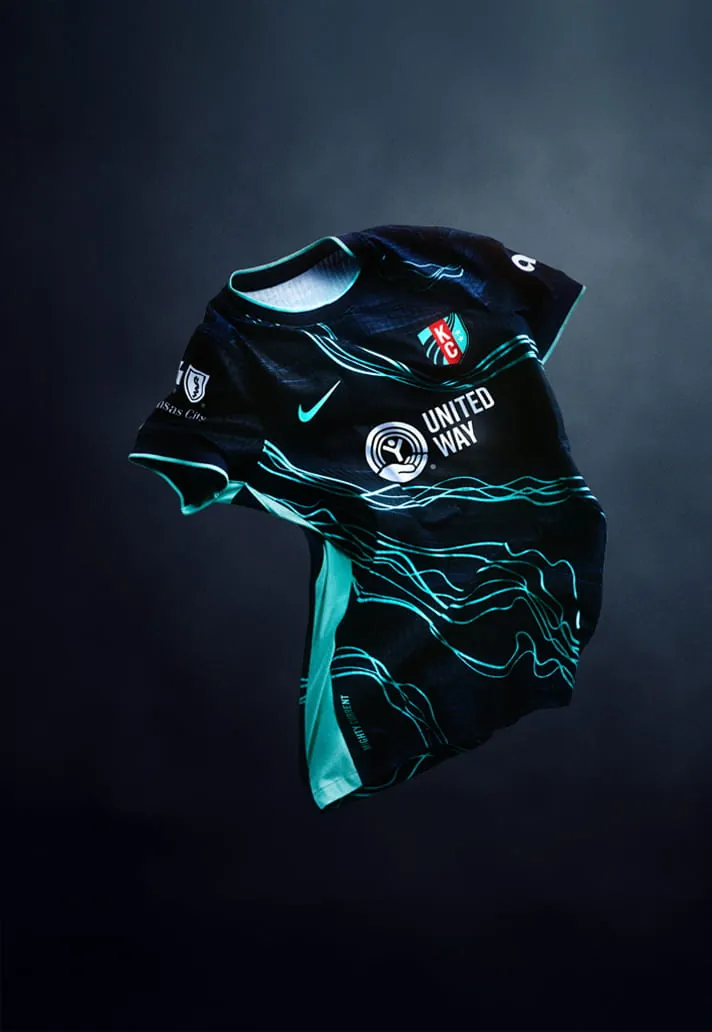
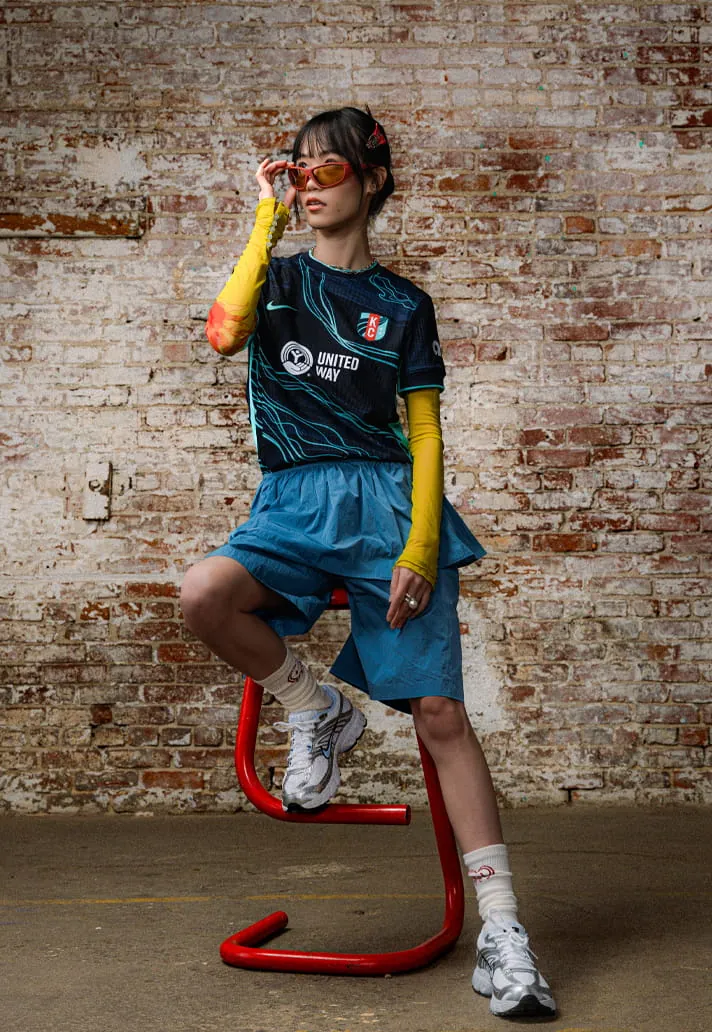
With a team name like “Current,” the club could have ended up with a dried‑up grape or an electricity motif. Thankfully, the electric route was taken, and the execution is striking—a strong, literal representation.
1. Houston Dash
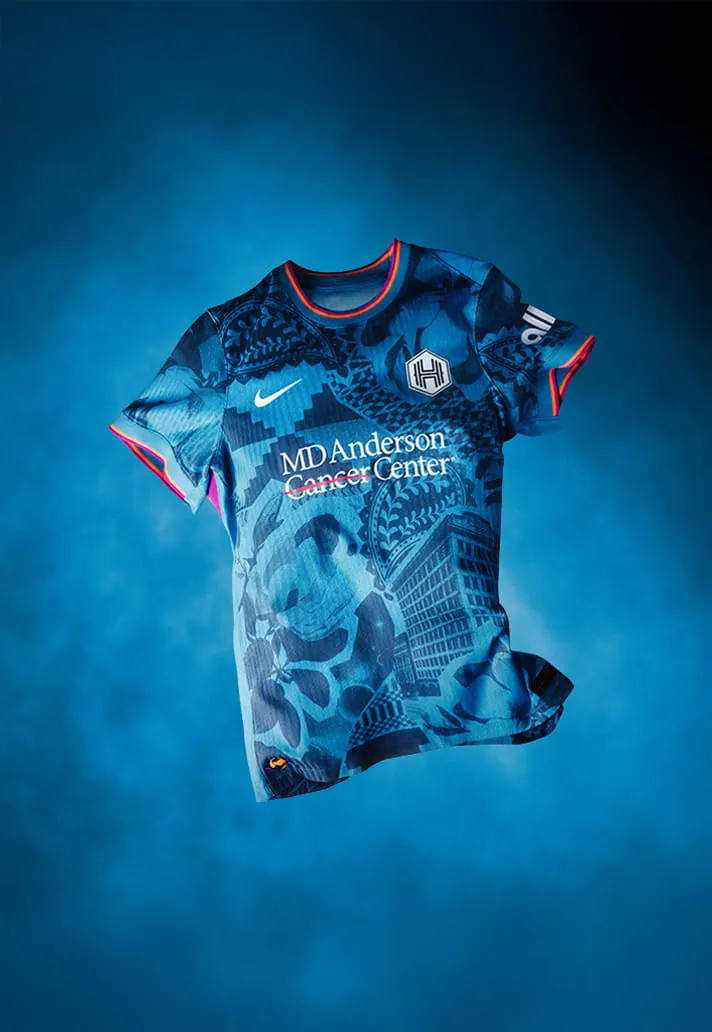
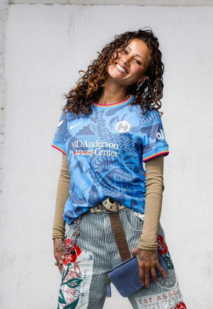
The ‘Houston Chronicles kit’ packs in five key elements: the original Houston Chronicle building, magnolia flowers for “Magnolia City,” a paisley cowboy motif, geometric textiles for diversity, and a “Space City” nod to NASA. It should not work, but it does—beautifully.
Related search topics
- Ranking The New Nike NWSL 2026 Kits football guide
- Ranking The New Nike NWSL 2026 Kits latest updates
 WhatsApp
Looking for affordable football boots and jerseys made in China?
Message us on WhatsApp at +86 151 6027 2505, or find us on Instagram at @luxurycoca.
 Instagram