FC Porto 2026/27 Away Kit: A Story-Led Purple Tribute to Port Wine Heritage
When a football kit connects directly to a club’s identity, the result can be genuinely memorable. FC Porto and New Balance have achieved exactly that with
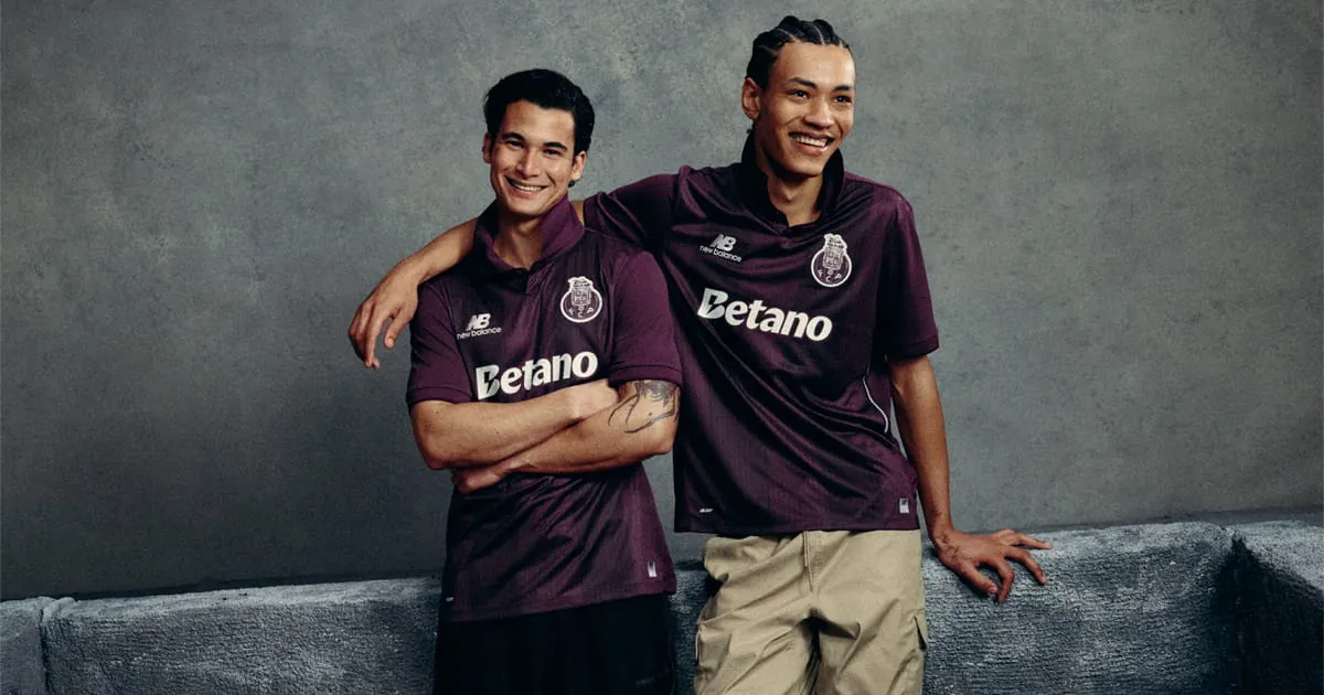
When a football kit connects directly to a club’s identity, the result can be genuinely memorable. FC Porto and New Balance have achieved exactly that with the 2026/27 away shirt, drawing inspiration from the city’s most famous export – Port wine. The deep purple base, thoughtful detailing, and monochromatic branding create a design that feels both bold and grounded in local heritage.
Inspiration from Port Wine
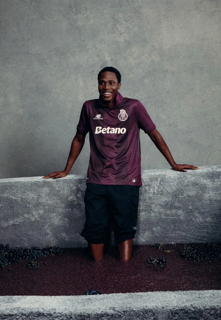
The design concept originates from the Douro Valley in northern Portugal, where Port wine is exclusively produced before making its way to the Atlantic through the city of Porto. That simple, powerful link between the product and the place gives the shirt a “why didn’t we think of this before?” appeal. It is a rare case of a kit that feels inevitable rather than arbitrary.
Design Details: Deep Purple Base and Tonal Striping
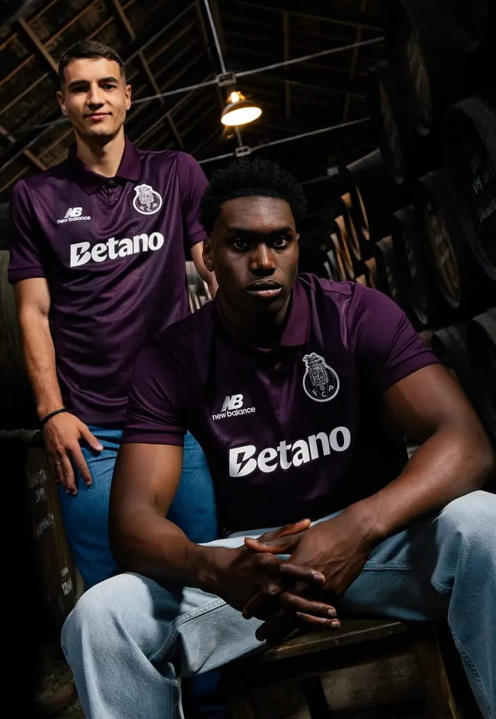
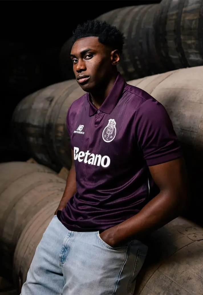
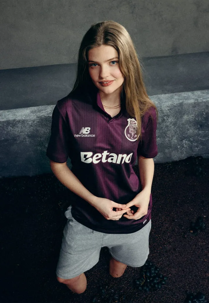
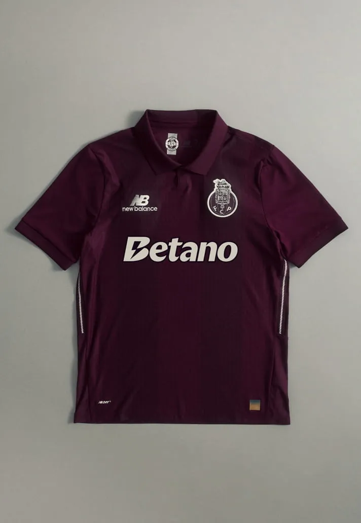
The shirt lands in a rich purple base, directly echoing the deep tones of Port wine. This is a daring choice in an era when away kits can lean safe or over-designed. The purple stands out immediately, but it does so in a way that feels grounded in authenticity rather than purely visual impact.
Subtle tonal striping runs through the fabric, adding texture and depth without complicating the classic football shirt silhouette. The execution remains clean – no unnecessary noise, just thoughtful detailing that rewards a closer look.
Monochromatic Branding for a Premium Look
One of the most deliberate touches is the monochromatic treatment of the club crest, sponsor, and New Balance branding. By blending into the base colour rather than competing with it, the overall aesthetic becomes sleek and unified. The understated approach feels intentional rather than muted, contributing to a modern, premium finish.
The Story Behind the Journey
Beyond the colour alone, the design reflects the journey of Port wine from the Douro Valley out to the world. That narrative mirrors FC Porto’s own identity – a club with deep local roots and a strong international presence. The shirt carries that blend of tradition and global ambition, giving it more weight than a standard away kit.
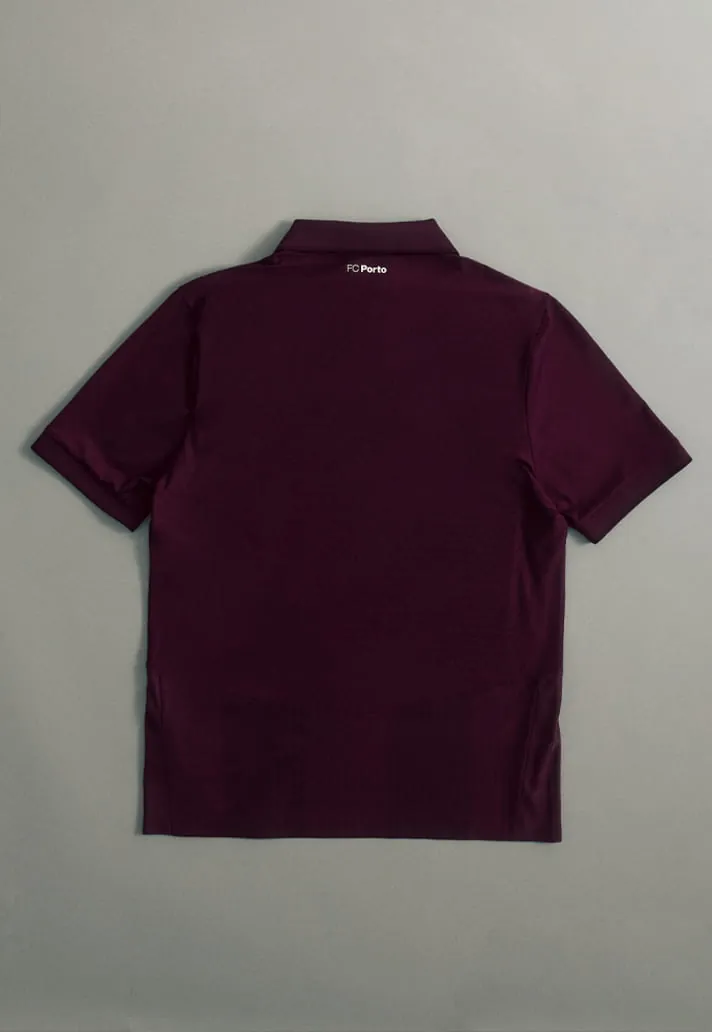
This is not simply a good-looking shirt. It tells a story, connects to place, and feels fresh in a jersey landscape that can sometimes lean repetitive. For the 2026/27 season, FC Porto and New Balance have produced a strong entry in story-led design.
Related search topics
- FC Porto s 26 27 Away Shirt Is a Masterclass in Story-Led Design football guide
- FC Porto s 26 27 Away Shirt Is a Masterclass in Story-Led Design latest updates
 WhatsApp
Looking for affordable football boots and jerseys made in China?
Message us on WhatsApp at +86 151 6027 2505, or find us on Instagram at @luxurycoca.
 Instagram