The Evolution of Lionel Messi's Argentina Jersey Typography (2006–2026)
For more than two decades, Lionel Messi’s international career has been etched not only in goals and trophies but also in the evolving fonts and numbers on
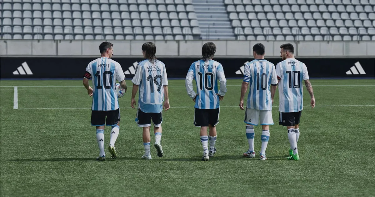
For more than two decades, Lionel Messi’s international career has been etched not only in goals and trophies but also in the evolving fonts and numbers on his Argentina shirt. From a teenage debutant wearing 15, 18, and 19 to the iconic number 10 that carried a nation, each World Cup and Copa America brought a distinct typeface that reflected its era. Adding to the legacy, the famous Argentina crest itself was conceived half a century ago by a Jewish superfan, while the latest 2026 jersey features the year “1893” — a nod to the founding of the Argentine Football Association — sparking widespread buzz.
Messi’s Argentina Kit Fonts: A Year-by-Year Breakdown
2006


Messi’s first World Cup in Germany. The adidas Teamgeist shirt used a font inspired by retro vinyl records, giving the 19 on his back a nostalgic, textured feel.
2008


An Olympic gold medal and Copa America appearances saw Messi switch from 19 to 15. The numbering was bold and minimal, matching the raw energy of his early style.
2010
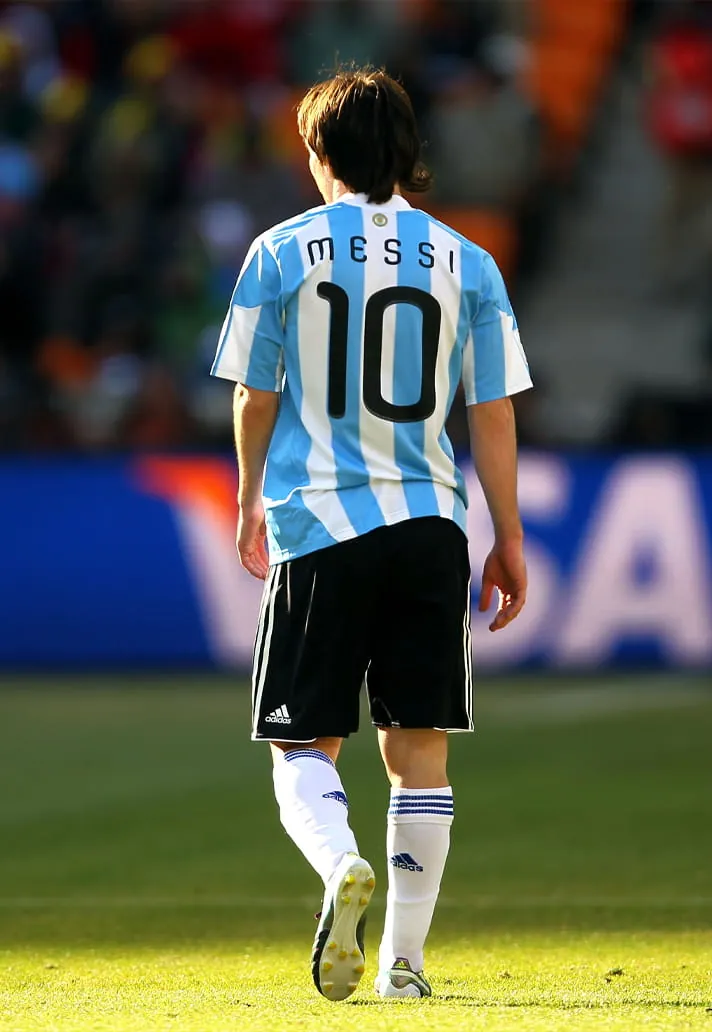

The number 10 arrived for the South Africa World Cup. The lettering was soft and bubble-like, with thick, curvy digits that gave the kit a warm, almost hand-drawn character.
2011
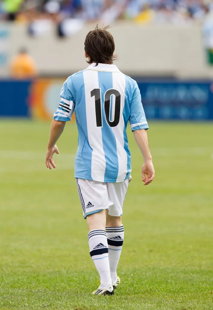

After being named captain, Messi wore a clean retro-styled shirt with only numbers — no nameset — lending a vintage simplicity to the design.
2014

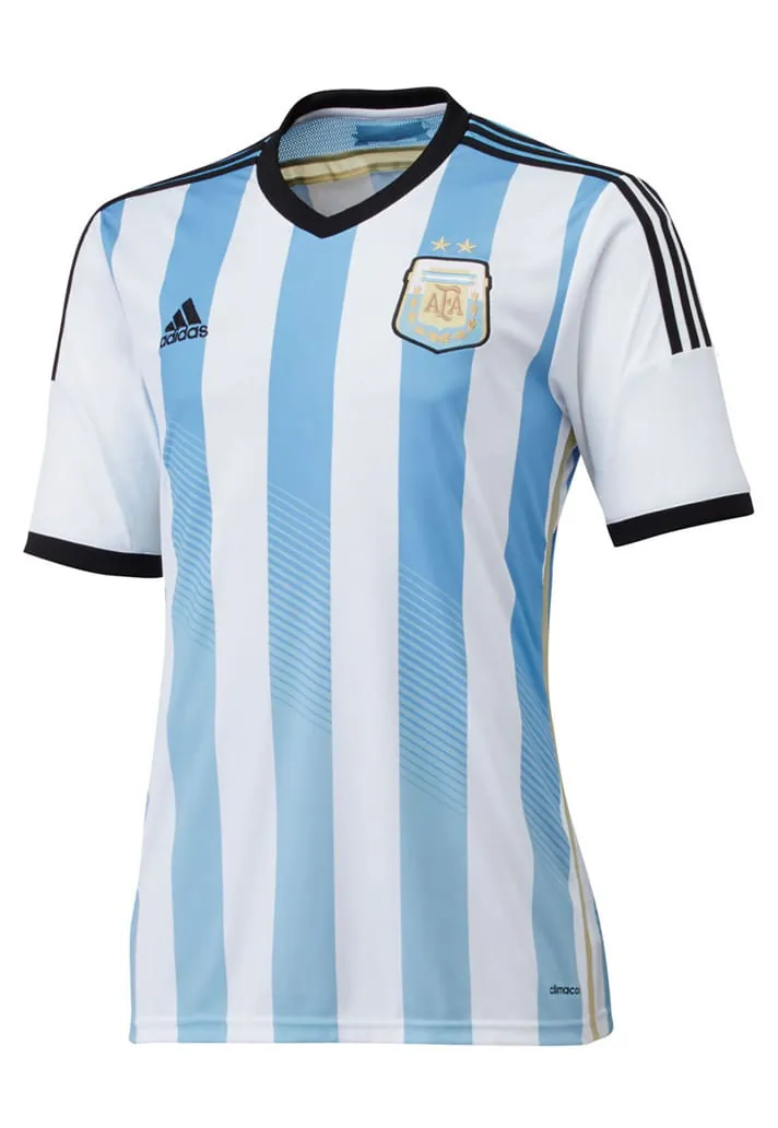
A no-nonsense font for the Brazil World Cup. Clean, compact, and efficient — a stark contrast to Messi’s flair on the pitch, yet equally tidy.
2016


Two years later, only the shape of the number 1 changed subtly, making this iteration a near‑invisible evolution from 2014.
2018
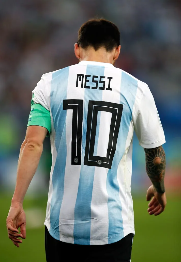

Russia 2018 brought a squared, geometric typeface with sharp angular corners. The digital‑style design aligned with adidas’s tournament‑wide aesthetic.
2019

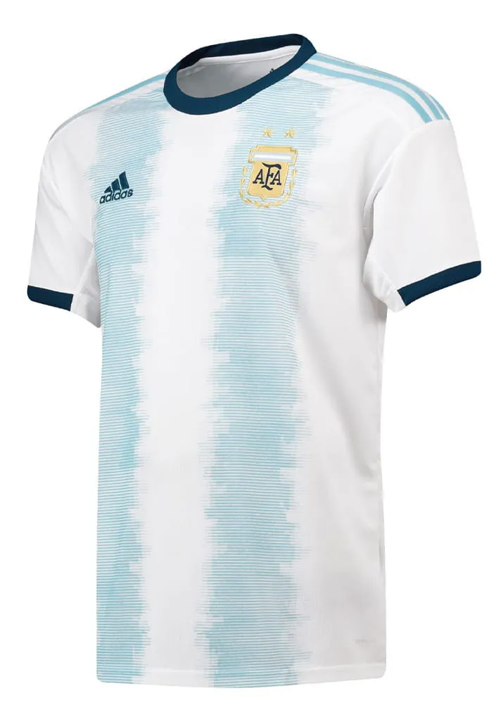
A teal‑tinted print with a faint 3D shadow gave the font a breezy, retro‑modern feel. Many consider this one of the most complementary typefaces ever used on an Argentina shirt.
2021

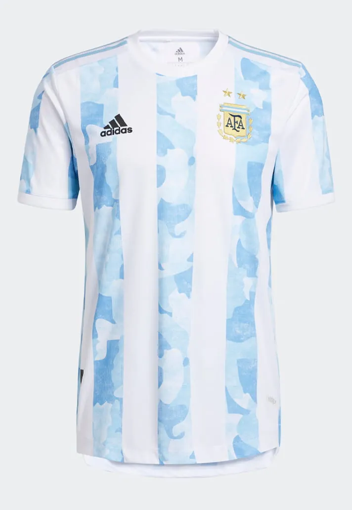
Slim, rounded lettering combined with bold, sculpted numbers. A subtle shadow effect added depth, perfectly suiting the dream‑like, cloudy kit base.
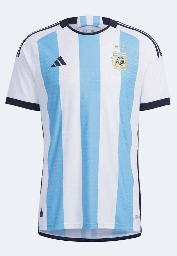
2022

 ]
]
Blocky numbers with angular cuts and segmented shapes gave the Qatar World Cup kit a battle‑ready, tech‑driven look — the most significant of Messi’s career, given the eventual triumph.
2024


Wearing the regal status of world champions, the Copa America font featured slim, slightly rounded lettering and bold numbers with a soft 3D shadow, all bordered in subtle gold.
2026
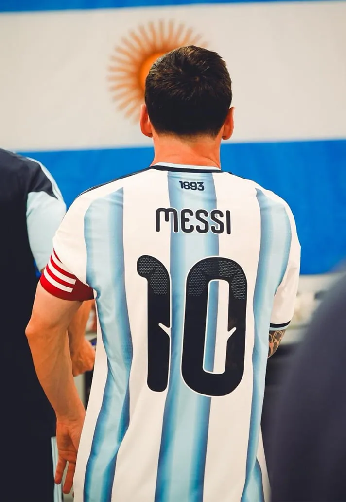

For what is expected to be his final World Cup, the typeface leans retro yet modern: rounded, playful lettering paired with wide‑set numbers that use soft curves and generous inner shapes. The inclusion of “1893” on the jersey references the founding year of Argentina’s football association, adding historical depth to the design.
Related search topics
- Messi s Argentina Kit Font Through The Years football guide
- Messi s Argentina Kit Font Through The Years latest updates
 WhatsApp
Looking for affordable football boots and jerseys made in China?
Message us on WhatsApp at +86 151 6027 2505, or find us on Instagram at @luxurycoca.
 Instagram